Juruá Pescados
A company dedicated to selling fish from the Amazon region while promoting environmental, social, and ethical awareness.
2023 - 2024

Bringing Rich Flavors to Everyday Moments
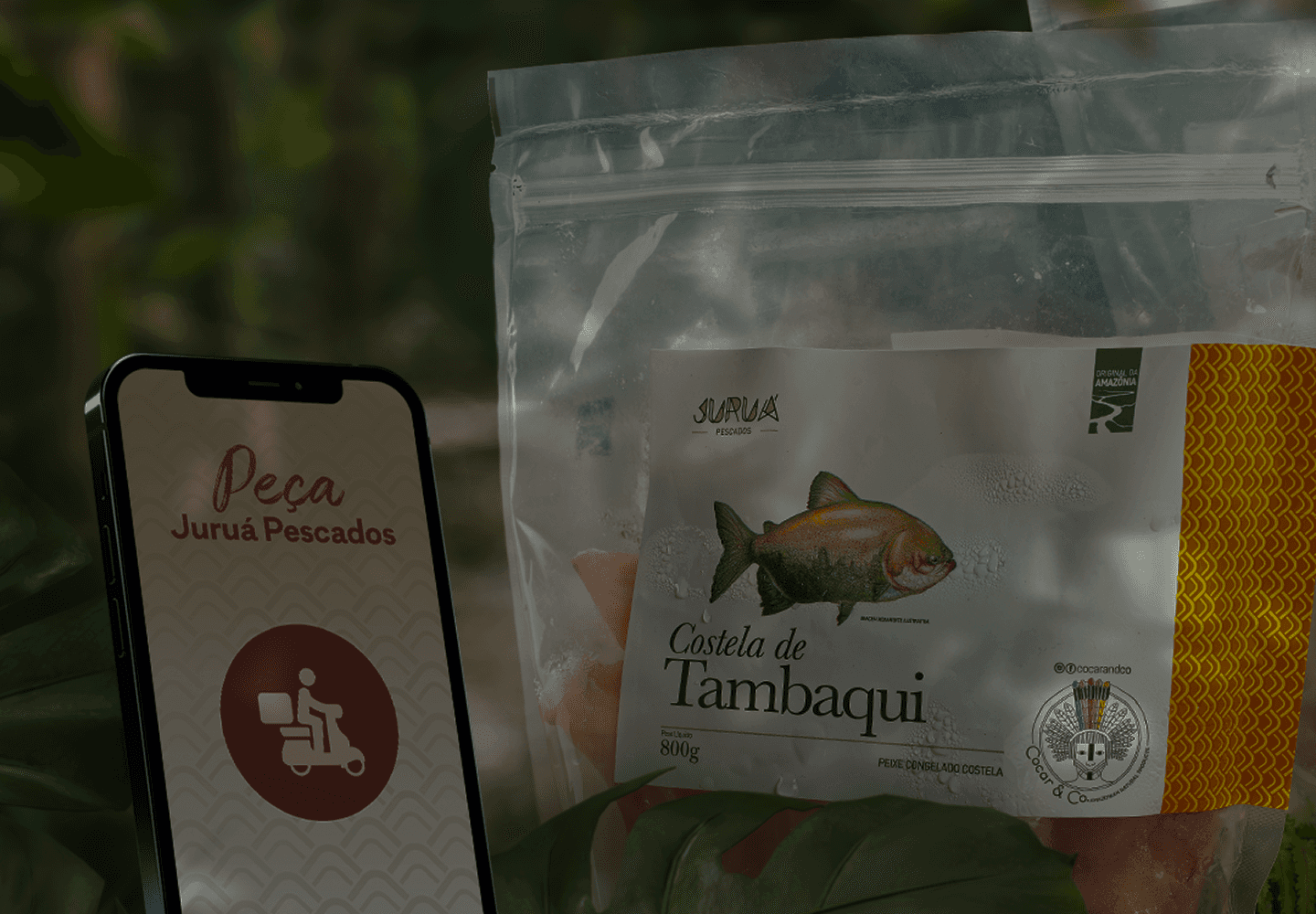
As part of my work with the Juruá team, I was responsible for designing the packaging for the first product in a new line: 365 – Juruá Todo Dia.
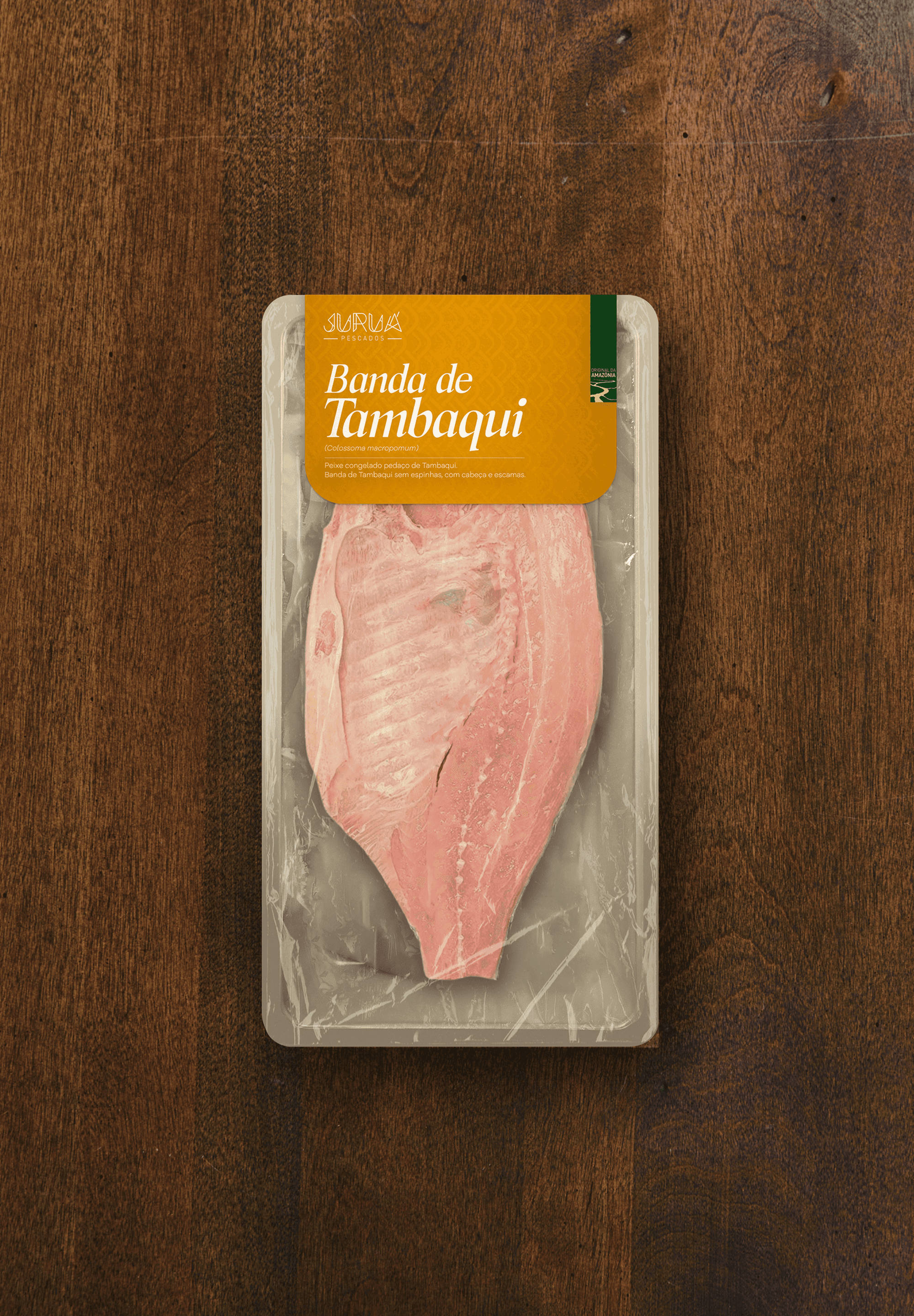
The first item in this line was Banda de Tambaqui, a cornerstone of Amazonian culture. Often served at communal meals and celebrations, it symbolizes abundance and brings people together to enjoy its rich flavor.
The goal was to make it more accessible for everyday meals, offering convenience and Juruá’s signature quality at an affordable price.

Refined, Yet Relatable
The packaging needed to reflect Juruá’s premium visual identity while introducing a dynamic, vibrant touch. The goal was to maintain its high-end appeal, but with a friendlier, more approachable feel to connect with a broader audience.

Each packaging reflects the unique colors of the fish's skin. The Pirarucu features its reddish tone, while the Aruanã highlights its yellow scales.
For this product, this concept was adapted with a golden-orange tone to represent the Tambaqui’s top golden skin, paired with Juruá's signature texture, which mimics the fish scales.

Designing for connection
I also designed Instagram posts for Juruá, guided by strategies tailored to their target audience: consumers interested in natural, organic foods and regional cuisine.
The goal was to create visually appealing content that combined storytelling with educational insights, promoting products while building a deeper connection with the audience.
I achieved this by creating immersive posts using image manipulation to capture attention and keep viewers engaged with every new image.